Monday, October 31, 2011

Jack O' Lantern


 Here is the source image for my jack o' lantern:


And here is my animated image:

Creating this image was fun, but I also found it difficult. I had some trouble finding the correct colors to use when "carving" the pumpkin, and I had to recolor parts of my picture and use clipping masks before saving and posting because parts of the background were invisible and the pumpkin still had fuzzy lines around it. I think that the easiest part of the image to create was the stalk.

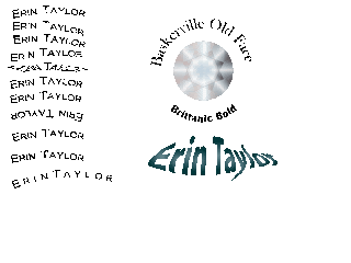
Cool Type Effects

This is my type on a path tutorial. I liked using the skew and 3D ribbon options for the type, but I thought the gravity setting made the letters harder to read. I think that the centering options will help when I am trying to put text in a certain area or if my text needs to follow a certain path.

Flower And Vase

Here are my results from the completed flower and vase tutorial. I had trouble animating the vase because my base shape was slightly different than the shape used in the tutorials, so I used trial and error to find the correct layer to apply the flower to.

Thursday, October 20, 2011

Personal Expression

I decided to stay with an overall blue theme because blue is one of my favorite colors and it is also cool and calming. I vectored my image and changed the color scheme to gray to complement the blue gradient. The circles in the background used light tints of cool colors, which also go with the blue gradient and add texture to the background. I used three different fonts for my words to express what the words mean to me, and I also tried to curve the text around my image and help contribute to the meaning of the word. I used a flowing font (Amienne) for words such as "musical" because I felt that the gentler curves of the letters complemented both the meanings of the words and the blue background. For word that expressed my relationship with other people, such as "sister," I used a more formal font that retained some of the gentle curves (Gabriola). I felt that this better expressed my feelings about those words. Finally, I used a squarer yet elegant calligraphic font (Calligraphic 421 BT) to express both the formality and my personal attachment to those words, such as "pensive."

Wednesday, October 5, 2011

Snowboarder Live Trace

Here are my source images for the snowboarders:


And here is my live trace:

I enjoyed using the live trace option and recoloring the images, but I found it harder to replicate the swooshes behind the snowboarders. I like the layering effect that was used in the image, though.