Thursday, November 8, 2012
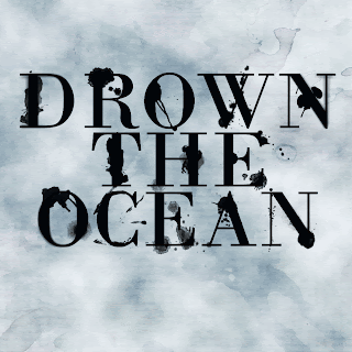
Wet Ink Typography-Drown the Ocean
I made these images using the same tutorial as my previous post. I experimented with some of the newer Photoshop features, including the Image>Adjustments>Variations option and the new Iris Blur option. The first image has an Iris Blur applied to the text, the second image has a Field Blur applied to the text, the third image has no special features applied, the fourth image has the text blend mode set to Overlay and duplicated, and the fifth image has the same text effect as the fourth , as well as additional brush splatters in the background.
Tuesday, November 6, 2012
Wet Ink Typography-Seize the Night
I made this image using mainly this tutorial, but I also incorporated some elements of the Inked Typography tutorial from one of my previous posts. I like the effect that the water/ink drops and coffee cup stains produce, and the effect of the rendered clouds make it look more aged. I think some of the letters might be too cluttered, but I've been staring at these words too long and I honestly can't tell. I decided to use the text "Seize the Night" because our band's theme for this year's marching show was "Carpe Noctem" ("seize the night" in Latin).
Subscribe to:
Comments (Atom)


