Friday, August 26, 2011
A Short Bio
I'm currently a junior and I love reading, music, drawing, and history.I have a sister at AMCMS, a sister at Oakwood, and a brother at College Hills. I also play the flute, march in the band, and I once took a fencing class. I hope this year will be the best yet!
Wednesday, August 24, 2011
10/3
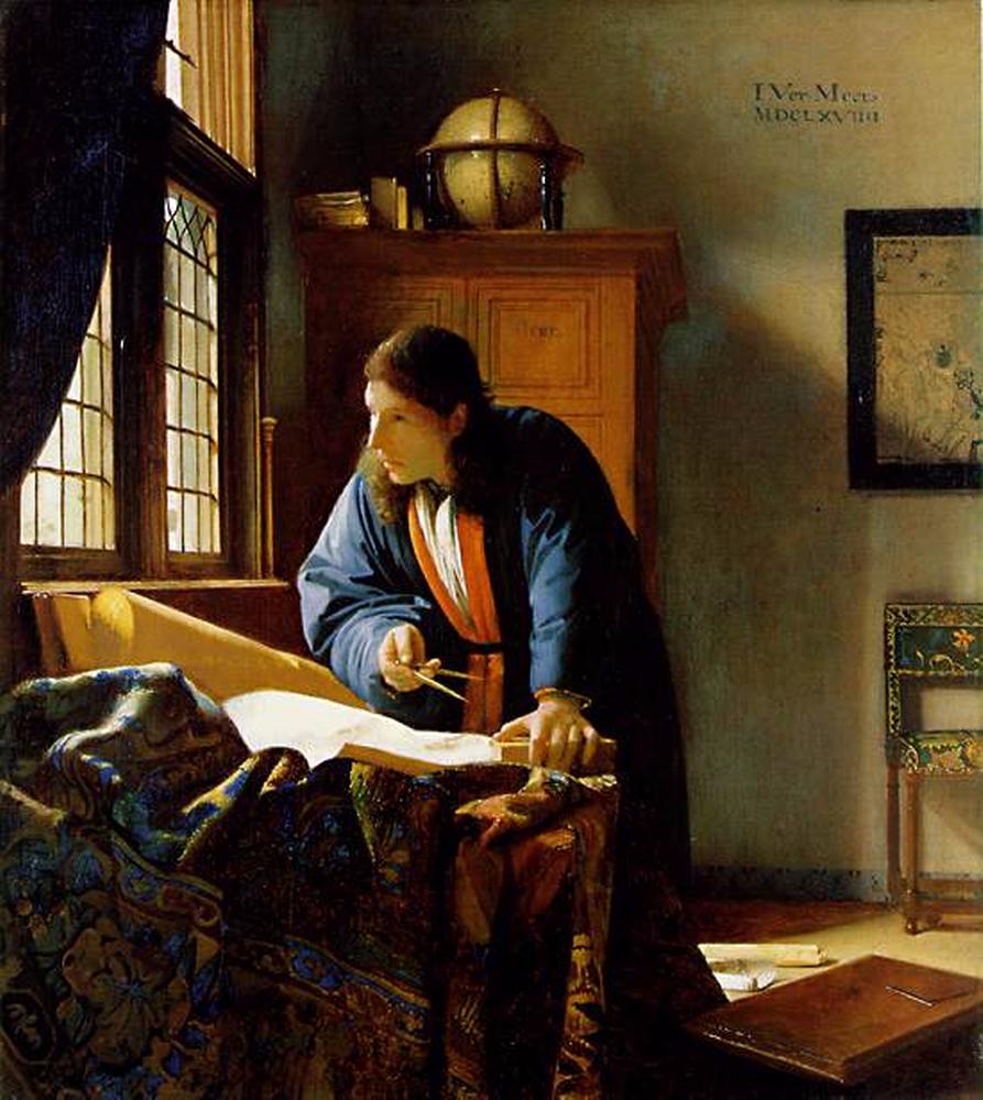
- Proportion-- the sizing of the wall map and the cabinet are relative to the size of the Geographer.
- Color-- the robes adds emphasis to his figure.
- Texture -- the folds add depth and a realistic feel to the rug.

I like this picture because it is almost inspiring, in a way. The courage of the small "Captain America," trying to defend another kid, is touching and almost comical. I also like the small details, such as the discarded milk carton, which give the picture a feeling of depth. However, my favorite aspect is the facial expressions of the three children. The "nerdy" kid looks confused and worried, the "bully" looks surprised and annoyed, while the miniature "Captain America" looks grimly determined.
- Balance-- the positions of the boys are used to help the eye flow throughout the painting
- Proportion-- to emphasize the relative sizes of the boys.
- Movement-- the dynamic postures of the boys.
- Color-- the contrast of the bully (in darker clothing) and "Captain America" (in brighter blue, red, and white) also create emotion and character.

- Proportion-- the size of the people in the background.
- Balance-- the immense wall of books and the huge, sloping floor.
- Color-- the darker books contrast with the lighter floor and ceiling.
- Pattern-- the books are arranged in a pattern.
- Space-- the lack of any major interrupting objects gives the picture a feeling of space.

- Emphasis, Color-- the position and color of the lightning make it the focus of the picture.
- Line, Movement-- the shape of the lightning gives it a feeling of motion.
- Space-- the mostly empty background gives the lightning a feeling of immense size because it fills much of the space.
- Texture-- the curves and lighting of the clouds give it a realistic look.

- Emphasis, Color-- the bright color of the squirrel helps make it the focal point of the picture.
- Movement-- the suspended ice crystals and dynamic posture of the squirrel.
- Texture-- the the fluffiness of the fur and the slight patterns in the snow.

- Line-- the trails of light and exhaust all lead to the flying city.
- Color-- the use of shadow, light, and glare add realism to the picture. Also, the orange, pink, and purple colors of the clouds give a sense of sunrise or sunset.
- Proportion-- the size of the buildings on the ship in relation to the ship itself, as well as the sizes of the smaller ships.
- Movement, Balance-- asymmetrical with the large "Solidarity" and the smaller ship in the front right balancing each other and creating a flow for the eye to follow.

- Line-- the trees act as vertical lines, suggesting loftiness and balance. The slight curves of the path suggest restfulness.
- Color-- the green evokes nature, life, and refreshment.
- Proportion-- the relatively larger size of the trees in the foreground and the smaller trees in the background.
- Emphasis, Space-- the open path creates space between the trees and forms a point of emphasis.

I enjoy this picture because it surprises me. The diver swimming past the submerged bench, over the grass, looks very strange, almost as if he were flying instead of floating. I also enjoy the distorted reflection on the water's surface. Despite it's unusual subject, the browns, greens, and grays and the picture are calming, and make me slightly sleepy.
- Balance-- asymmetrical between the diver and the bench.
- Line-- the slightly diagonal lines of the bench are confusing, but the slight curve of the water's surface is graceful and restful.
- Color-- the blue of the watery background adds coolness to the image, while the green adds a feeling of life and nature. The shocking red of the diver's suit seems very out of place.
- Texture-- the ripples of the water's surface, the flowing of the grass.

I enjoy this picture because it reminds me of winter, and thus Christmas and times spent with family. The elongated shapes of the icicles around the berries and the casing of ice around the branch makes me feel a slight chill of cold and anticipation for the colder seasons to come. The red of the branch and berries, contrasting with the green of the grass and translucent white of the ice, also reminds me of the eventual spring that will drive the cold away melt the ice.
- Color-- the red of the berries evokes passion, but the white ice, representing purity, encases the berries. The green of the grass adds life to the image.
- Line, Pattern-- the complex web of branches creates a pattern for the eye to follow throughout the picture.
- Balance-- the near symmetry of the branches.
- Emphasis-- the bright, contrasting color of the berries.

- Balance-- asymmetrical formed by the glass and empty space.
- Emphasis-- the bending of light around the words love and light creates emphasis.
- Line-- the vertical "lines" within letters suggest balance, power, and support, while the curved lines in the letters suggest grace.
- Color-- the lack of bright color adds more focus to the shapes and lines.
- Shape-- the circular piece of glass suggests completeness.
Subscribe to:
Comments (Atom)