Tuesday, December 20, 2011

Final Exam

I used this tutorial to create my snowflake pattern:
http://www.vectordiary.com/illustrator/snowflakes-tutorial/
I used my previously created gift boxes and ornaments, and I created my own star without using a tutorial. To make the star glow, I used a gaussian blur and stylize>outer glow until I liked the look.
This is my pattern portion:
And this is my completed pattern:


Thursday, December 15, 2011

Gift Boxes

These boxes took FOREVER. Dividing the ribbon to make it weave between the boxes was difficult because the tutorial didn't explain how to divide shapes, but I like the way it turned out overall. Making the wrapping paper gradients was fun, and making the shapes 3D was interesting.

Friday, December 9, 2011

Holiday Ornament

Yay for Christmas! Anyway, this is the ornament I made following this tutorial. I liked creating the scatter brush and then modifying the transparency and the Gaussian blue to make the snow, but making the tree reflection was more difficult because the tutorial left out a step. I like the way the burst pattern and the snow give the image a feeling of depth and motion.

Wednesday, December 7, 2011

Dirty Water


I thought the dirty water tutorial was easy (and the water drop is just cute), but sometimes it was hard to find the correct shades of brown for the gradients in the water drop. I also really liked using the new art brush to make sediment in the water drop.

Wednesday, November 30, 2011

Pattern Creation

I made this pattern using the third tutorial. The base pattern is at the top, and the square is filled with the pattern swatch. I like the flowing lines of the pattern, but the low quality of the image (the source for Live Trace was a .jpeg) really bothers me. I think the gold and white look nice together.

Tuesday, November 29, 2011

Foundation Logo

These are some of my variations of the Character Integrity Accountability logo for the College Station Foundation. I tried to make the logo look similar to an official stamp, so I included both red and maroon versions. I also included desaturated versions of each variation and shrank the logos down to what I hope is near a business card size. My favorite variations are Groups 2 and 4 because I believe that the retained their legibility when shrunk and they are the simplest and therefore easiest to read and recognize.

Tuesday, November 22, 2011

Business Card

This is the front and back of my business card using the logos from the previous post. I like the blue gradient color scheme because it feels cool and looks nice with the silver of the logo, and I feel like the silver/blue combination makes it look more professional. I added the shapes on the back using a clipping mask and overlay because I wanted to draw attention to the middle of the card and separate my personal information from the company's information.

Friday, November 18, 2011

Personal Logo Creation

These are the three versions of my personal logo (I tried to scale the smaller images to about 1/4 inch, but I'm not sure if the sizing is right). I don't know why, but on Blogger right now the images seem a bit grainy. Both images are greyscaled because I couldn't find a color scheme that I liked, but if you have any suggestions please tell me :)

Tuesday, November 15, 2011

More Logo Art

I chose to use this tutorial because I liked the organic lines and color scheme of the design, as well as the small details such as the water droplets and the soil. Creating the correct gradients for the leaves and the ladybug was difficult because the gradients add a more realistic effect, and the wrong colors or angle change the look of the image. However, I did like applying the vine effect to the main text.

Mesh Art

I based my color scheme off of some of the color schemes on kuler. My quote is from "Heart of the Ocean" by Gaelic Storm and I used darken and a dark gray color for the words to match the background gradient. I'm not completely happy with the font, but I couldn't find one that I liked better than this one. I also followed the tutorial's suggestion to make the image landscape instead of portrait. I used the Crystallize tool on Illustrator to create all the spiky shapes between the overlapping layers, which I think adds texture to the image. I also used the Flare tool just for fun :)

Wednesday, November 2, 2011

Logo Creation

This is my completed image from the logo creation tutorial. I like the way the letters were all based on circles because that made the shapes easier to work with, although I had some trouble with the layering of the images. I was eventually able to fix most of the layering problems and I found colors that were fairly close to the ones used in the tutorial.

Monday, October 31, 2011

Jack O' Lantern


 Here is the source image for my jack o' lantern:


And here is my animated image:

Creating this image was fun, but I also found it difficult. I had some trouble finding the correct colors to use when "carving" the pumpkin, and I had to recolor parts of my picture and use clipping masks before saving and posting because parts of the background were invisible and the pumpkin still had fuzzy lines around it. I think that the easiest part of the image to create was the stalk.

Cool Type Effects

This is my type on a path tutorial. I liked using the skew and 3D ribbon options for the type, but I thought the gravity setting made the letters harder to read. I think that the centering options will help when I am trying to put text in a certain area or if my text needs to follow a certain path.

Flower And Vase

Here are my results from the completed flower and vase tutorial. I had trouble animating the vase because my base shape was slightly different than the shape used in the tutorials, so I used trial and error to find the correct layer to apply the flower to.

Thursday, October 20, 2011

Personal Expression

I decided to stay with an overall blue theme because blue is one of my favorite colors and it is also cool and calming. I vectored my image and changed the color scheme to gray to complement the blue gradient. The circles in the background used light tints of cool colors, which also go with the blue gradient and add texture to the background. I used three different fonts for my words to express what the words mean to me, and I also tried to curve the text around my image and help contribute to the meaning of the word. I used a flowing font (Amienne) for words such as "musical" because I felt that the gentler curves of the letters complemented both the meanings of the words and the blue background. For word that expressed my relationship with other people, such as "sister," I used a more formal font that retained some of the gentle curves (Gabriola). I felt that this better expressed my feelings about those words. Finally, I used a squarer yet elegant calligraphic font (Calligraphic 421 BT) to express both the formality and my personal attachment to those words, such as "pensive."

Wednesday, October 5, 2011

Snowboarder Live Trace

Here are my source images for the snowboarders:


And here is my live trace:

I enjoyed using the live trace option and recoloring the images, but I found it harder to replicate the swooshes behind the snowboarders. I like the layering effect that was used in the image, though.

Friday, September 30, 2011

Personal Choice Trace

Here is my source image:
And here is my trace of it:
This image was actually much harder to trace than I had originally thought. Tracing the Broadway sign was difficult because I had to adjust each letter so that it more exactly overlaid the original. It was also difficult to add the perspective of the building and the windows because the picture was taken at an angle. I had to be aware of which shades and tints I was using to add to the depth.

Tuesday, September 27, 2011

Logo Trace

Here is the source image of the sign: 
 

And here is my logo trace of it:
I thought that getting the sign shape exactly right was a bit challenging because at first I couldn't find the anchor points, but I thing trying to match the font of "fabulous" was the most difficult part of this assignment. I used kerning while trying to match the words to the template, especially in "Nevada" and "fabulous." I liked making the light bulb paintbrush, though, because for me that was the easiest part of the assignment.

Monday, September 26, 2011

Quote-Revisited

Here is my original image:
 
And this is my revised image:
I changed the color of "out" from blue to red because it seemed out of place, and I decided to try to curve the text around the word "in" because Brett suggested that it might look more like a fence. I also changed the font and coloring of the second one completely because it didn't seem to fit very well with the overall mood of the quote. I also bolded certain words in the second quote because it added emphasis and an almost triangular balance to the circular quote.

Monday, September 19, 2011

Glyph Monster

It was difficult to get a good fish shape, but once I began filling in the design it became much easier to make it look fishy. I tried to balance my space with the seaweed and smaller fish, and I like the way the blue and the white look together. I think the more vertical lines of the seaweed help contrast with the roughly horizontal lines made by the fish. Here is the original image from iStockphoto:

Monday, September 12, 2011

Quote Typing

First Quote: Style Elements and Principles:
  • Color--The red and blue colors create different feels for the words "in" and "out." "Out" is red, and so has a more aggressive feel than the calmer blue "in."
  • Emphasis--The red and blue type create emphasis on the words "in" and "out."
  • Shape--The shape of the text as a whole is similar to a small upwards triangle within a larger downward facing triangle, which leads the eye downwards to the end of the quote.
  • Balance--The words "in" and "out" are in the middle of the quote, giving it symmetrical balance.
Second Quote: Style Elements and Principles:
  • Color--The brown edging around the blue on the first part of the quote constrains (or fences) the blue, helping to interpret the quote.
  • Emphasis--The unedged blue text has more visual impact than the rest, thus drawing the eye towards the words. The all capital "in" and "out" also give emphasis to those words.
  • Line--The elongated characters in the text subtly suggest loftiness and power.

Friday, August 26, 2011

A Short Bio

I'm currently a junior and I love reading, music, drawing, and history.I have a sister at AMCMS, a sister at Oakwood, and a brother at College Hills. I also play the flute, march in the band, and I once took a fencing class. I hope this year will be the best yet!

Wednesday, August 24, 2011

10/3


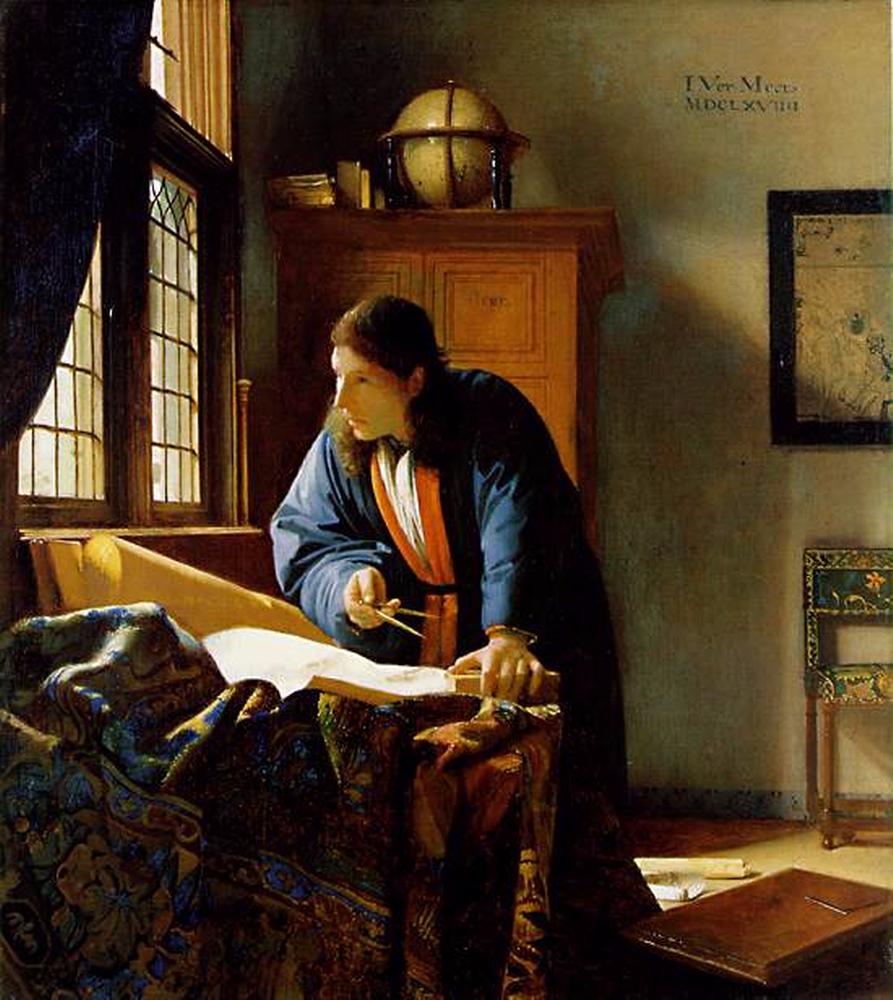
I really enjoy this picture of the painting "The Geographer" by Johannes Vermeer because the realistic color and detail add life to the work. This painting reminds me of the book Chasing Vermeer by Blue Balliet, which first interested me in Vermeer's works. I also enjoy the color contrast of the Geographer's blue and red robe with the bright rug and the more bland background because the colors focus the eye.
  • Proportion-- the sizing of the wall map and the cabinet are relative to the size of the Geographer.
  • Color-- the robes adds emphasis to his figure. 
  • Texture -- the folds add depth and a realistic feel to the rug.


I like this picture because it is almost inspiring, in a way. The courage of the small "Captain America," trying to defend another kid, is touching and almost comical. I also like the small details, such as the discarded milk carton, which give the picture a feeling of depth. However, my favorite aspect is the facial expressions of the three children. The "nerdy" kid looks confused and worried, the "bully" looks surprised and annoyed, while the miniature "Captain America" looks grimly determined.
  • Balance-- the positions of the boys are used to help the eye flow throughout the painting
  • Proportion-- to emphasize the relative sizes of the boys.
  • Movement-- the dynamic postures of the boys. 
  • Color-- the contrast of the bully (in darker clothing) and "Captain America" (in brighter blue, red, and white) also create emotion and character.


I enjoy this picture because, frankly, I enjoy reading and if I ever walked into a room like this I would die of happiness. I like the group of people in the back left of the picture because they add a sense of scale to the picture, creating a feeling of awe stemming from the sheer size of the room. I also like the sense of space and grandeur that the picture imparts with the sloping floor and the immense wall of books.
  • Proportion-- the size of the people in the background.
  • Balance-- the immense wall of books and the huge, sloping floor.
  • Color-- the darker books contrast with the lighter floor and ceiling.
  • Pattern-- the books are arranged in a pattern.
  • Space-- the lack of any major interrupting objects gives the picture a feeling of space.

I like this picture because it makes me feel astonished at the awesome power and beauty of nature. I also enjoy the ambiguous shapes within the picture, particularly the shapes of the lightning and the clouds because they seem somehow threatening. Finally, I like the simple color scheme within this picture: the mostly dark clouds and scenery cause the lightning and reflected light to almost glow.
  • Emphasis, Color-- the position and color of the lightning make it the focus of the picture.
  • Line, Movement-- the shape of the lightning gives it a feeling of motion.
  • Space-- the mostly empty background gives the lightning a feeling of immense size because it fills much of the space.
  • Texture-- the curves and lighting of the clouds give it a realistic look.
I enjoy this picture because it amuses me and makes me laugh. The comical expression on the squirrel's face adds a touch of humor to the picture, while the blurred tail and the suspended ice makes me feel as though I am personally seeing the squirrel. The vivid contrast of the red fur against the white snow also adds character and a lifelike feel to the picture.
  • Emphasis, Color-- the bright color of the squirrel helps make it the focal point of the picture.
  • Movement-- the suspended ice crystals and dynamic posture of the squirrel.
  • Texture-- the the fluffiness of the fur and the  slight patterns in the snow.
I enjoy this picture because it impresses me with it's attention to detail and surprising elements. The use of light glare makes me feel as if I am looking through a window into another world. The cities, both upside down and right side up, that appear to be on the "Solidarity" intrigue me, and cause me to wonder at the true scale of the ship that is only seen partly emergent from the clouds. Finally, the use of realistic colors in the picture causes me to feel almost as if the image is of an ordinary nature, despite its extraordinary subject.
  • Line-- the trails of light and exhaust all lead to the flying city.
  • Color-- the use of shadow, light, and glare add realism to the picture. Also, the orange, pink, and purple colors of the clouds give a sense of sunrise or sunset.
  • Proportion-- the size of the buildings on the ship in relation to the ship itself, as well as the sizes of the smaller ships.
  • Movement, Balance-- asymmetrical with the large "Solidarity" and the smaller ship in the front right balancing each other and creating a flow for the eye to follow.
I enjoy this picture because it seems both ordinary and extraordinary, while retaining an edge of mystery. The cool greens, browns, and grays of the image have a calming effect upon my mind and make me feel as though I am in the middle of a distant forest. The mist gives the image an edge of uncertainty, which makes me wonder what is further down the path that I cannot see. Finally, the muted lighting gives the image an otherworldly feel, as though the forest were merely a shadow of itself, which intrigues me.
  • Line-- the trees act as vertical lines, suggesting loftiness and balance. The slight curves of the path suggest restfulness.
  • Color-- the green evokes nature, life, and refreshment.
  • Proportion-- the relatively larger size of the trees in the foreground and the smaller trees in the background.
  • Emphasis, Space-- the open path creates space between the trees and forms a point of emphasis.

I enjoy this picture because it surprises me. The diver swimming past the submerged bench, over the grass, looks very strange, almost as if he were flying instead of floating. I also enjoy the distorted reflection on the water's surface. Despite it's unusual subject, the browns, greens, and grays and the picture are calming, and make me slightly sleepy.
  • Balance-- asymmetrical between the diver and the bench.
  • Line-- the slightly diagonal lines of the bench are confusing, but the slight curve of the water's surface is graceful and restful.
  • Color-- the blue of the watery background adds coolness to the image, while the green adds a feeling of life and nature. The shocking red of the diver's suit seems very out of place.
  • Texture-- the ripples of the water's surface, the flowing of the grass. 

I enjoy this picture because it reminds me of winter, and thus Christmas and times spent with family. The elongated shapes of the icicles around the berries and the casing of ice around the branch makes me feel a slight chill of cold and anticipation for the colder seasons to come. The red of the branch and berries, contrasting with the green of the grass and translucent white of the ice, also reminds me of the eventual spring that will drive the cold away melt the ice.
  • Color-- the red of the berries evokes passion, but the white ice, representing purity, encases the berries. The green of the grass adds life to the image.
  • Line, Pattern-- the complex web of branches creates a pattern for the eye to follow throughout the picture.
  • Balance-- the near symmetry of the branches.
  • Emphasis-- the bright, contrasting color of the berries.

I like this picture because it contains a page from a book and makes me feel calm. I enjoy the simple color scheme of the image because it emphasizes the shapes and words within the picture more than the colors. Finally, I also like this picture because the use of the small curved glass piece emphasizes the words love and light, words with strong positive connotations for me.
  • Balance-- asymmetrical formed by the glass and empty space.
  • Emphasis-- the bending of light around the words love and light creates emphasis.
  • Line-- the vertical "lines" within letters suggest balance, power, and support, while the curved lines in the letters suggest grace.
  • Color-- the lack of bright color adds more focus to the shapes and lines.
  • Shape-- the circular piece of glass suggests completeness.